Taylor Johnston
I do the analysis, write the code and build the thing. I've made hundreds
of charts, built interactive maps and scrollytelling experiences and
wrangled more datasets than I'd like to admit — all in service of making
complicated things make sense. I'm happiest when the work actually changes
how someone understands something.
When I'm not in a spreadsheet, I'm either drawing on my iPad, listening to
an audiobook or collecting pins from somewhere I've traveled to.
Take a look at my work – or take a detour through a fun thing I made.
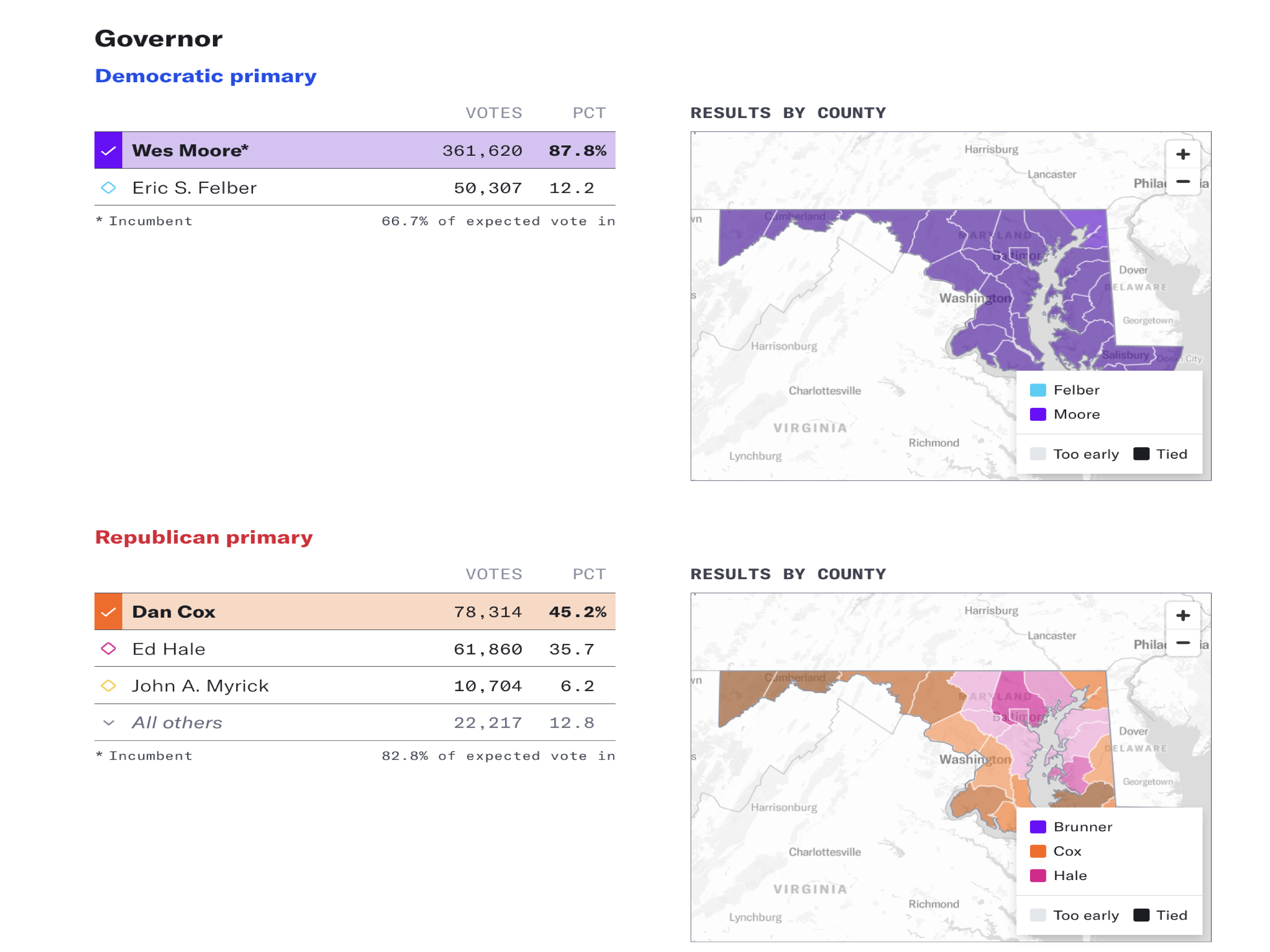
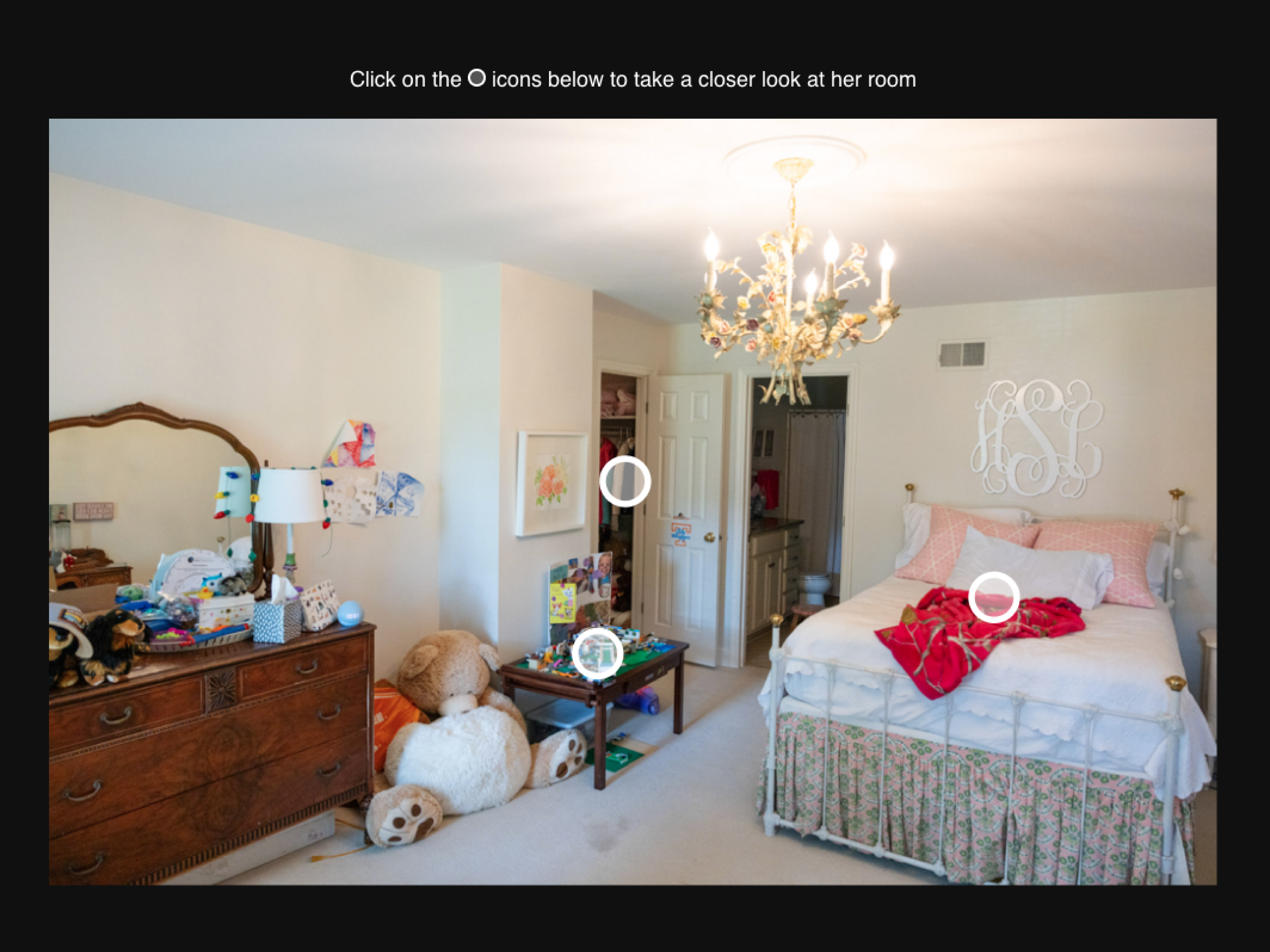
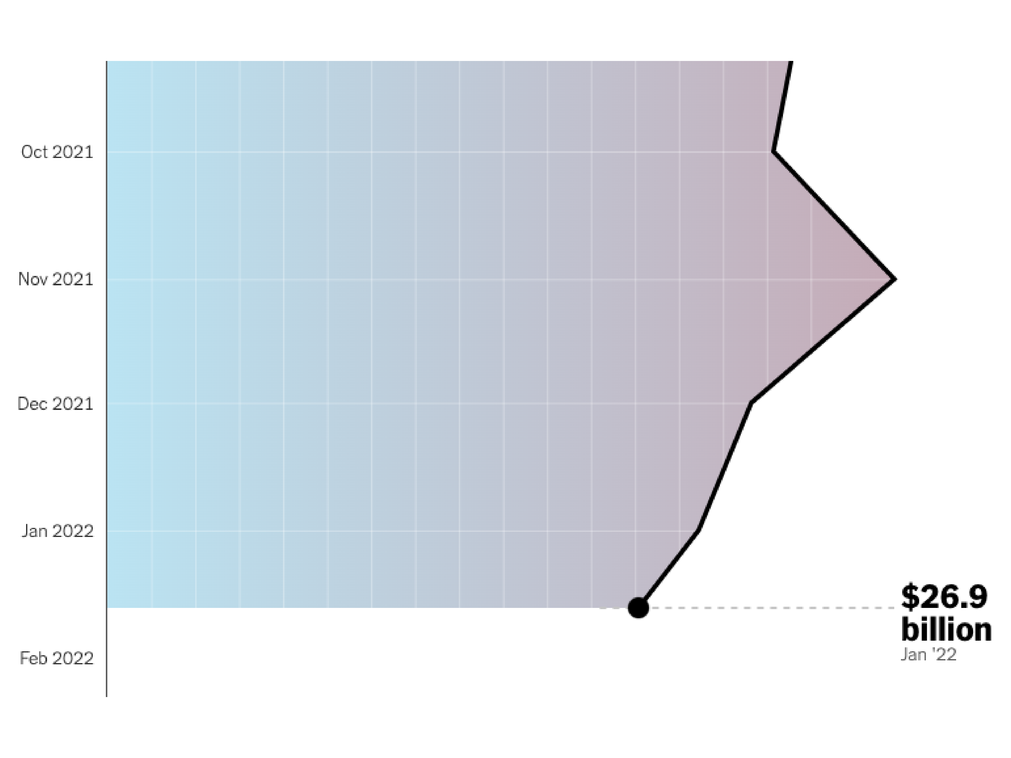
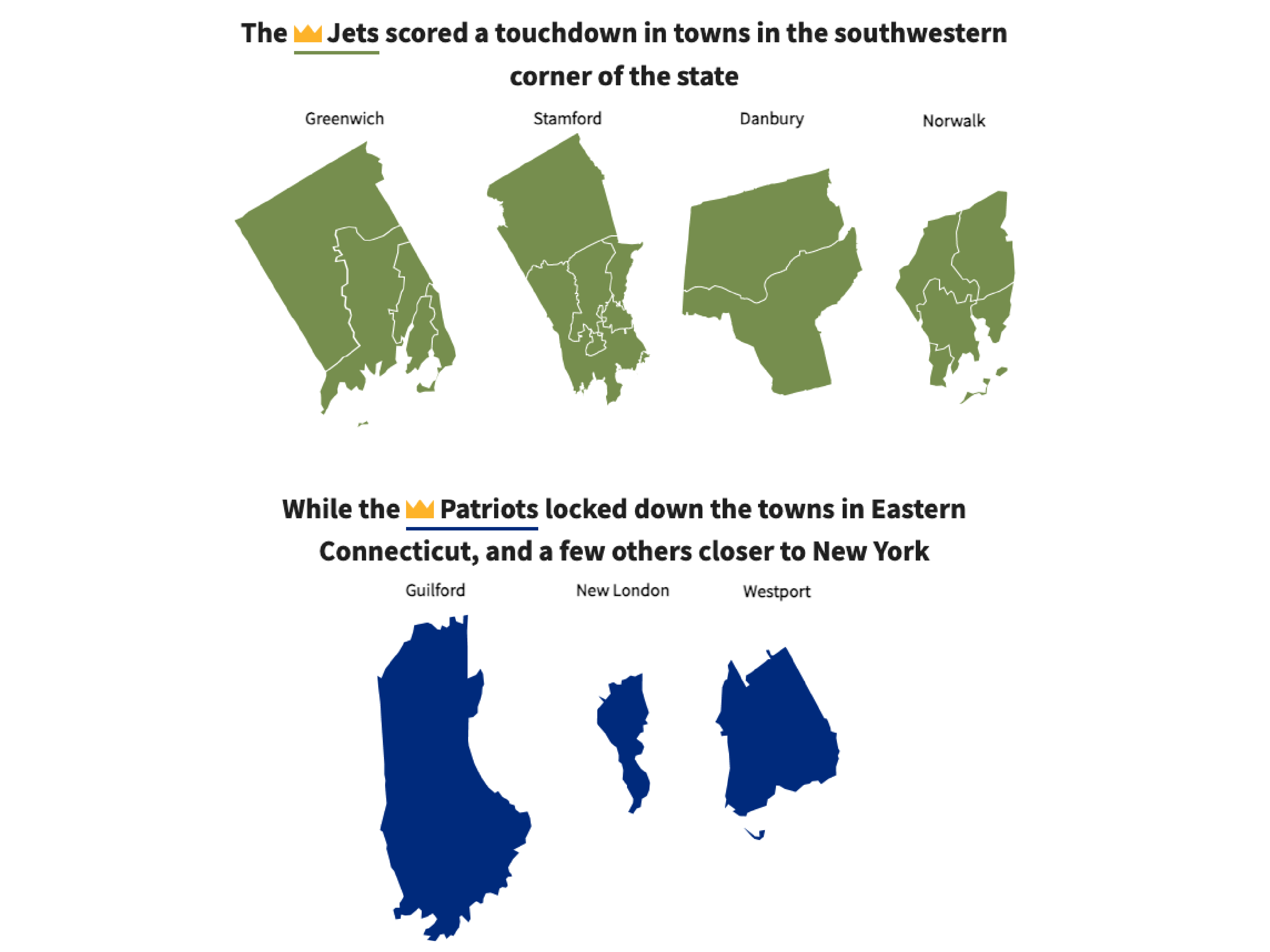
Social Security Fairness Act could restore benefits for millions, but policies still cause hardship
I reported and wrote the digital piece alongside leading the data analysis and visualization – covering a new law restoring full Social Security benefits to millions of teachers, firefighters and public employees locked out of the system for decades.
Note: Some graphics in original story may not render correctly following a CBS News site update after my departure. See it here.
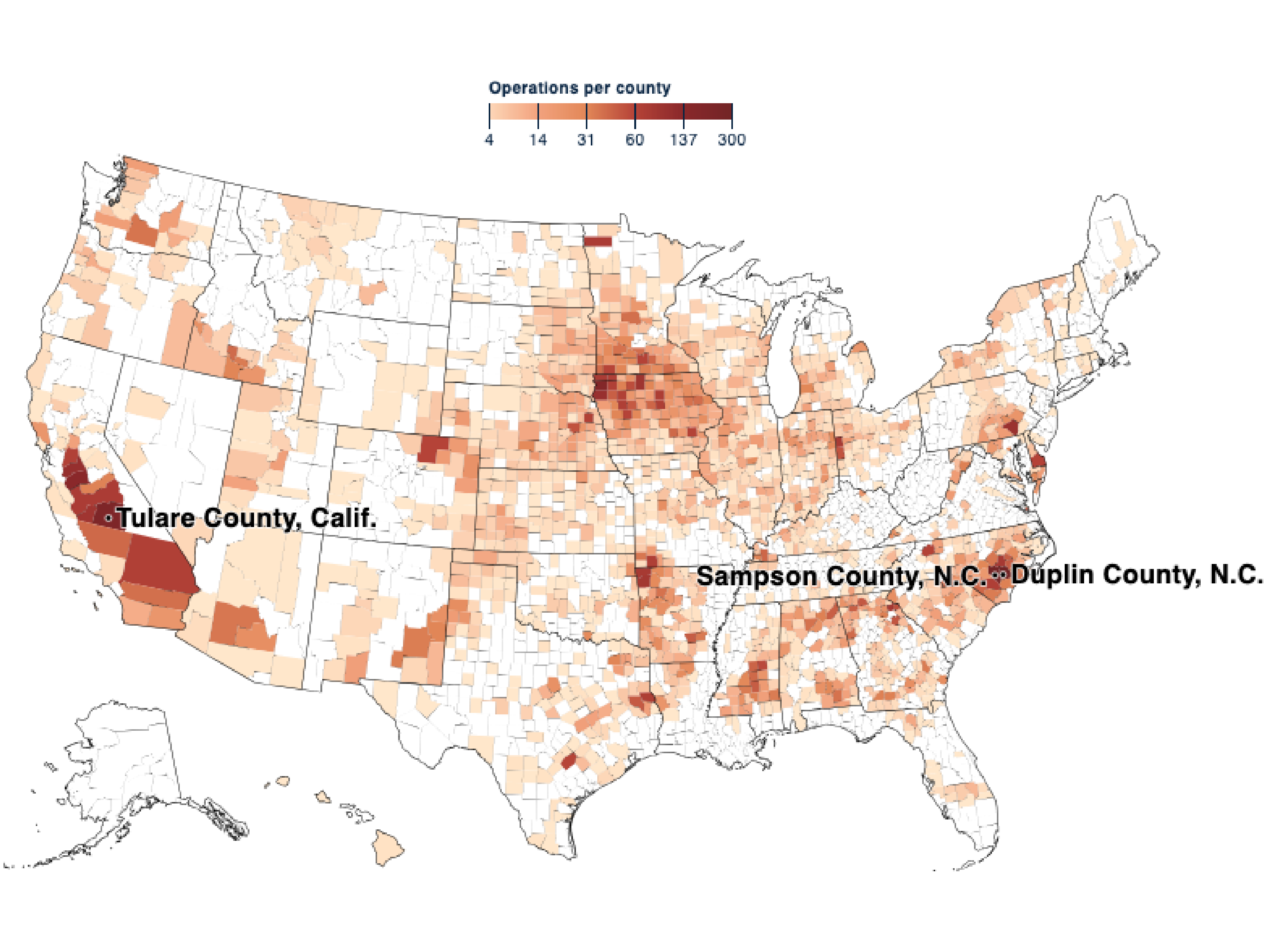
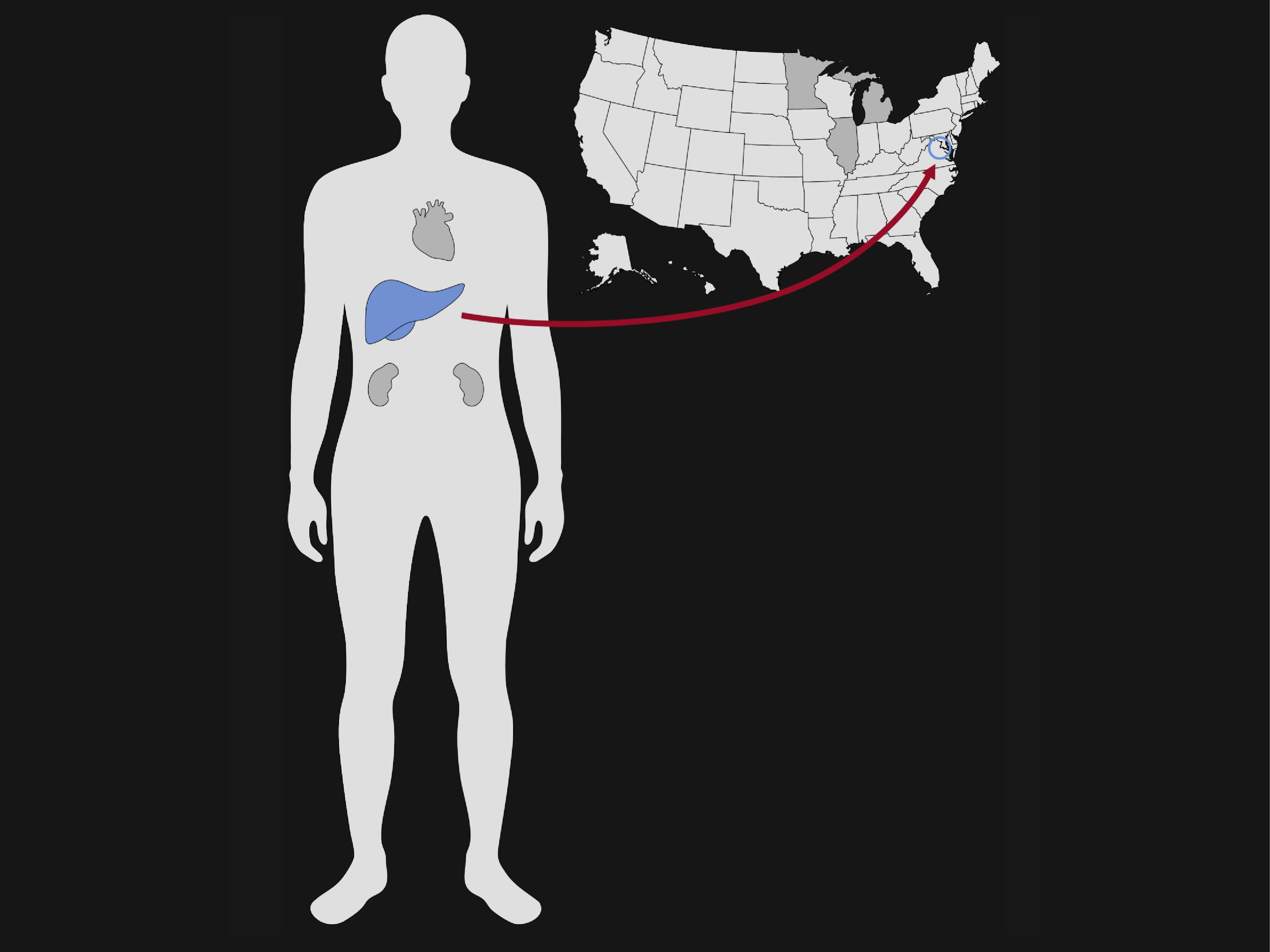
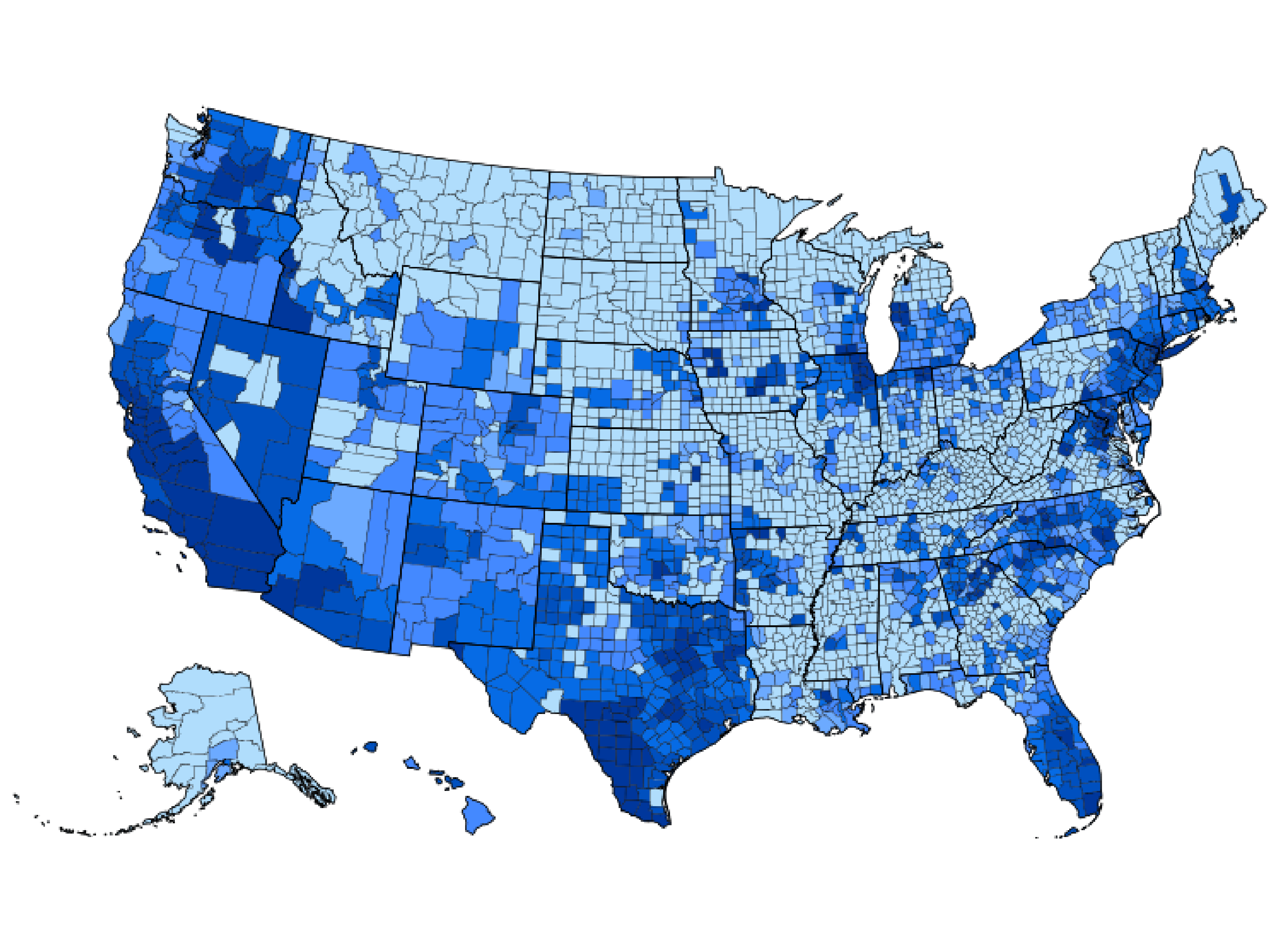
Minority communities twice as likely to have sewage polluting nearby river or creek
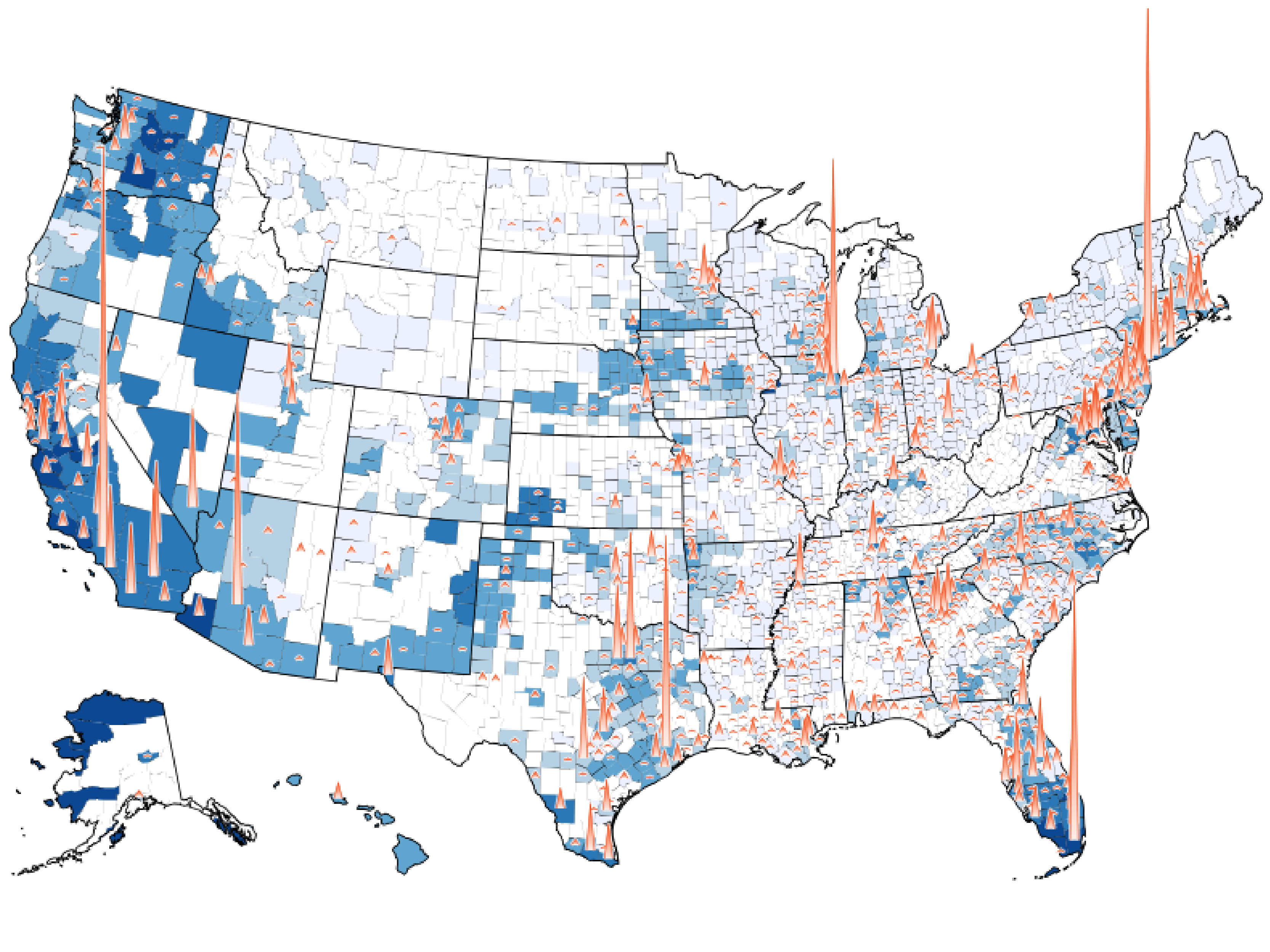
I led the data analysis and built the interactive map for a CBS News investigation – crossreferencing EPA sewage outfall locations with federal environmental justice data to find that lower-income minority communities are twice as likely to have wastewater dumping into a nearby river or creek.
Note: The map in the original story may not render correctly following a CBS News site update after my departure. See it here.
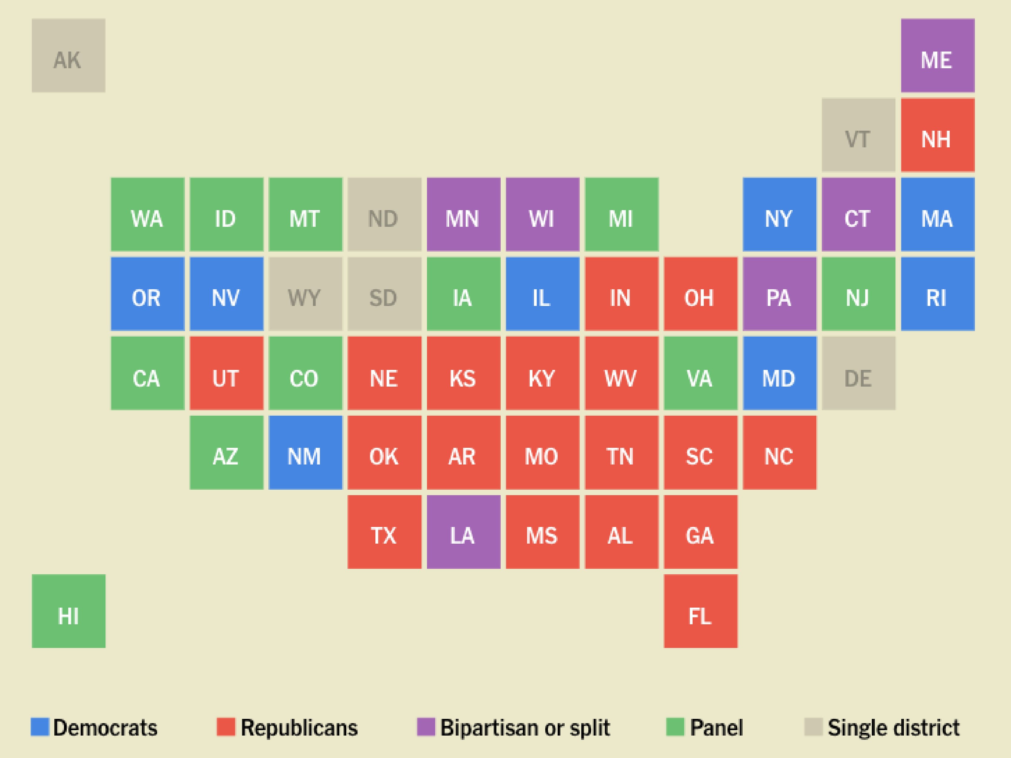
Hundreds of proposals in Project 2025 match Trump's policies
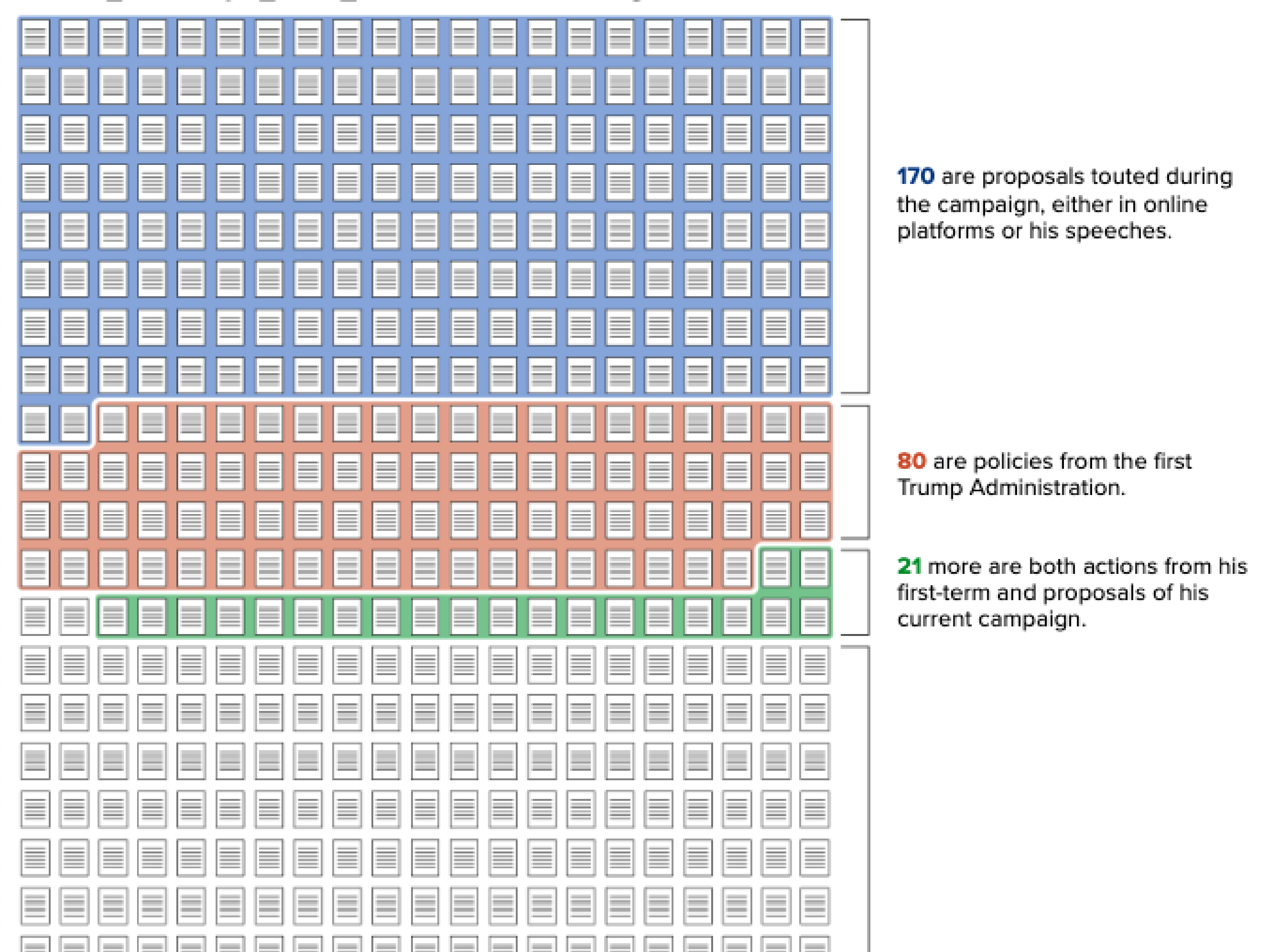
Note: One of the graphics from the original story may not render correctly following a CBS News site update after my departure. See it here.
D.C. cherry blossom charts show where to see the iconic trees as they hit peak bloom
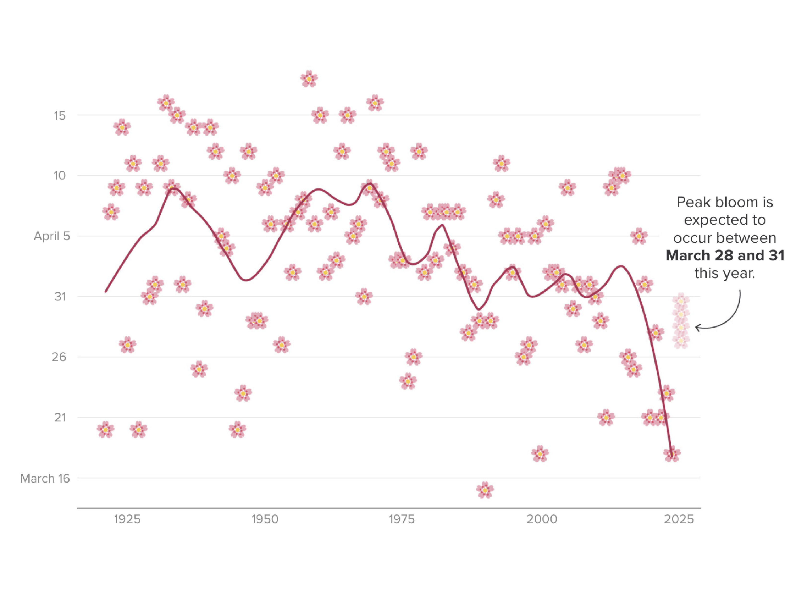
Note: One of the graphics from the original story may not render correctly following a CBS News site update after my departure. See it here.
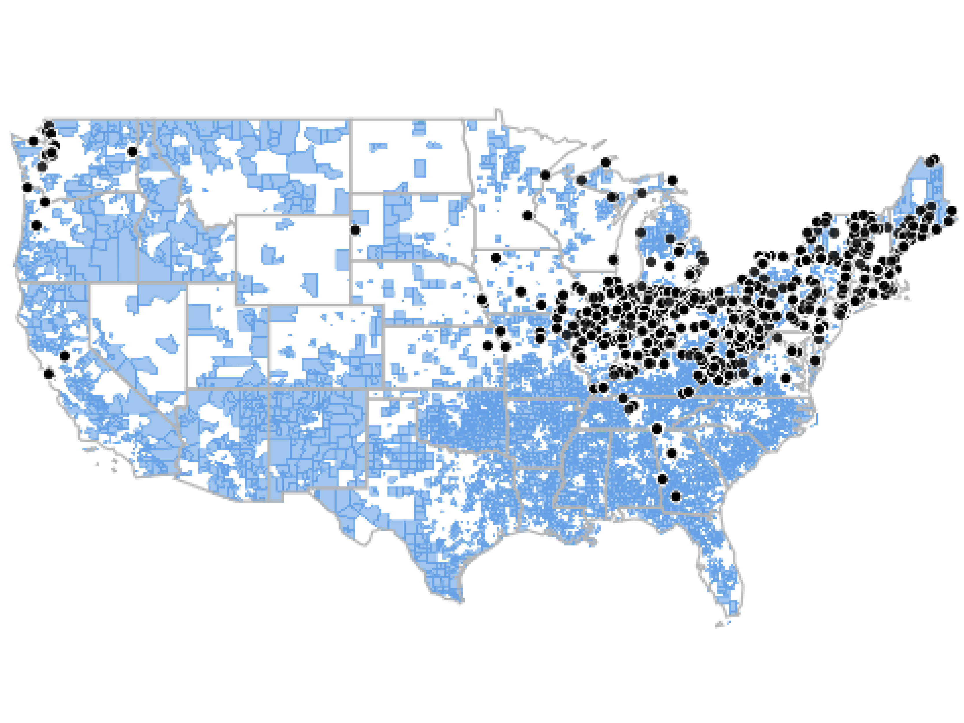
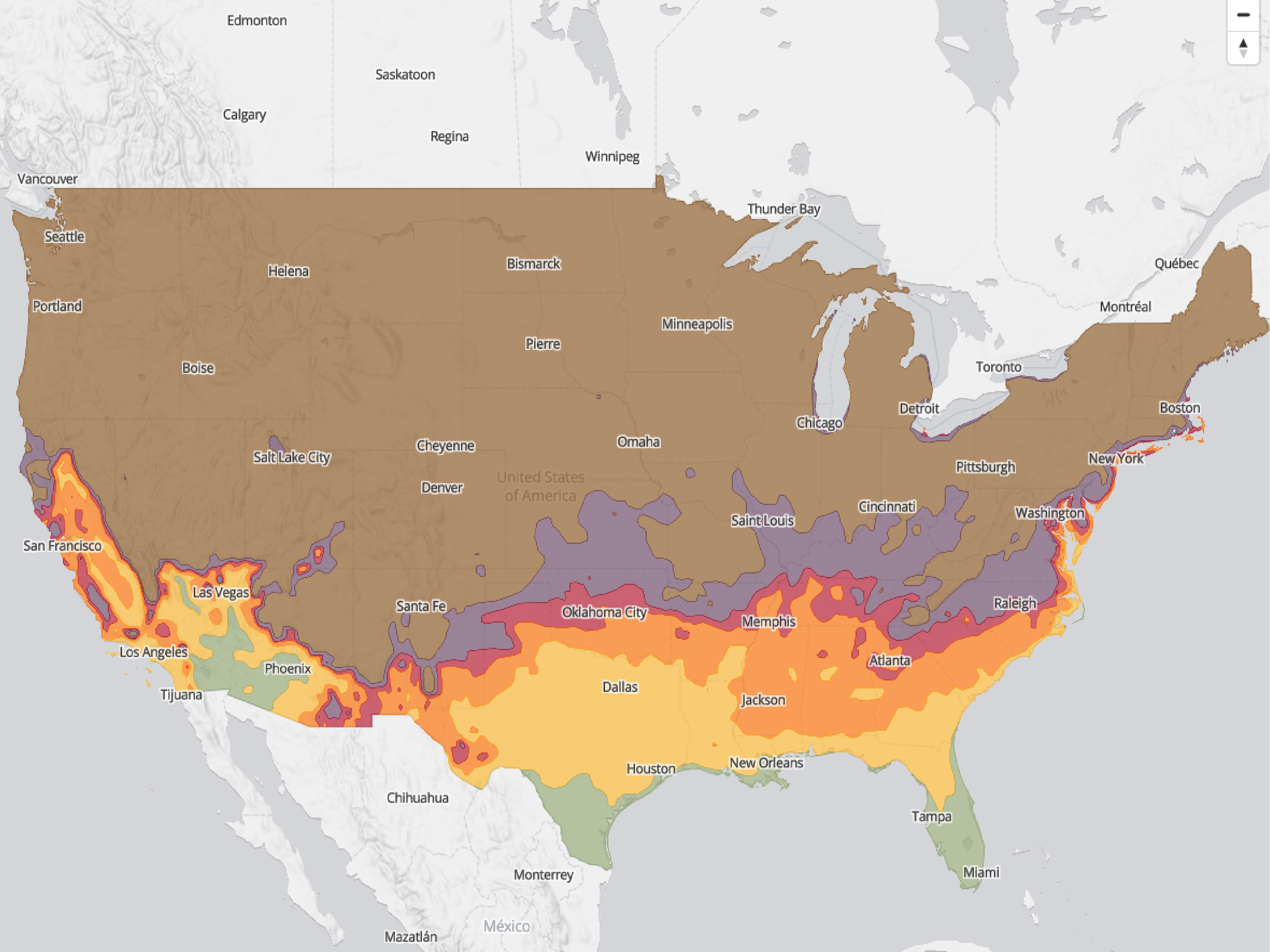
What are the chances of a white Christmas where you live? Map shows likelihood of snow.
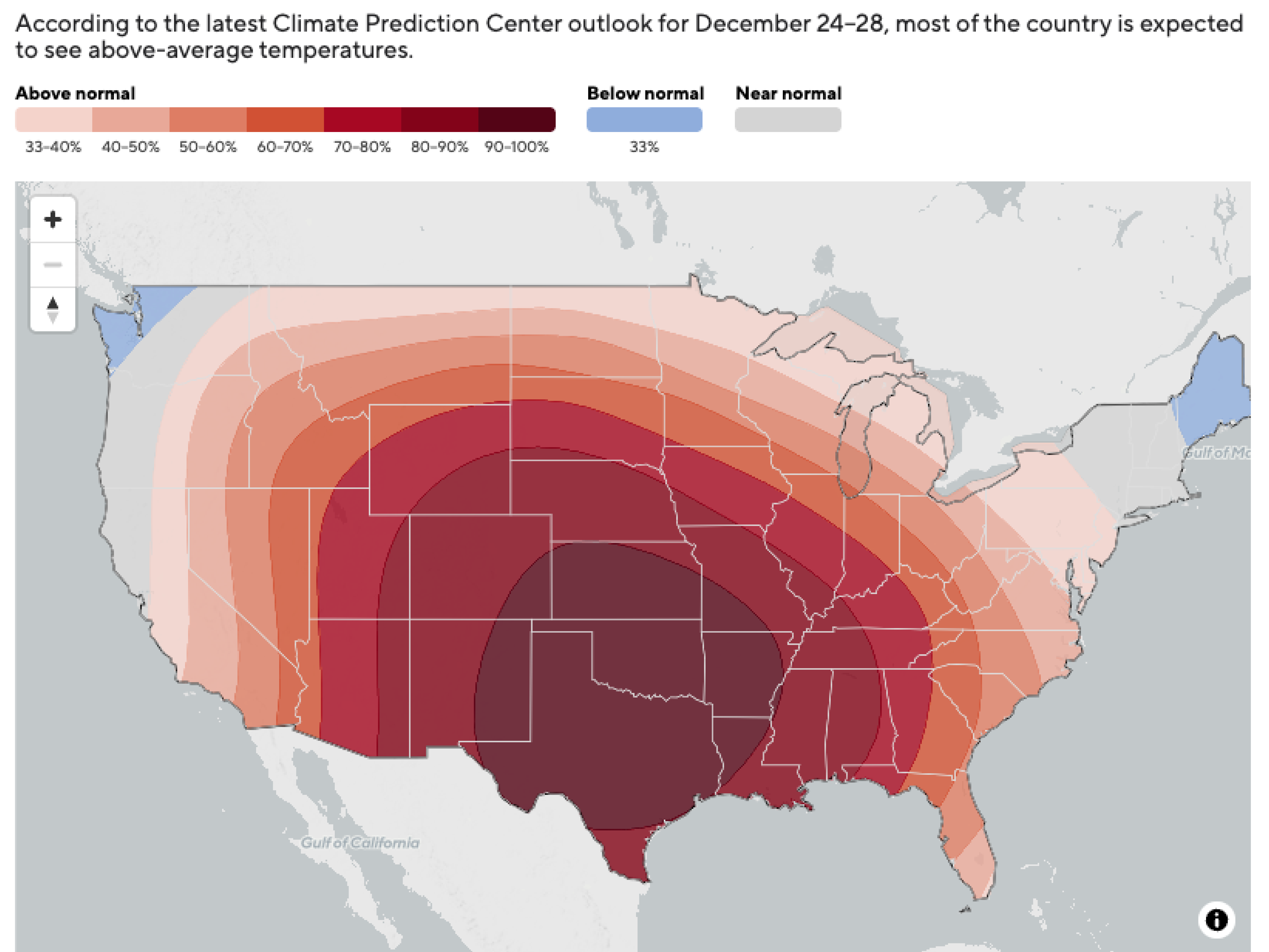
I pitched, reported and built an interactive tool letting readers explore their chances of a white Christmas – pulling temperature and snowfall data into maps that could be explored.
Note: The maps in the original story may not render correctly following a CBS News site update after my departure. See them here and here.
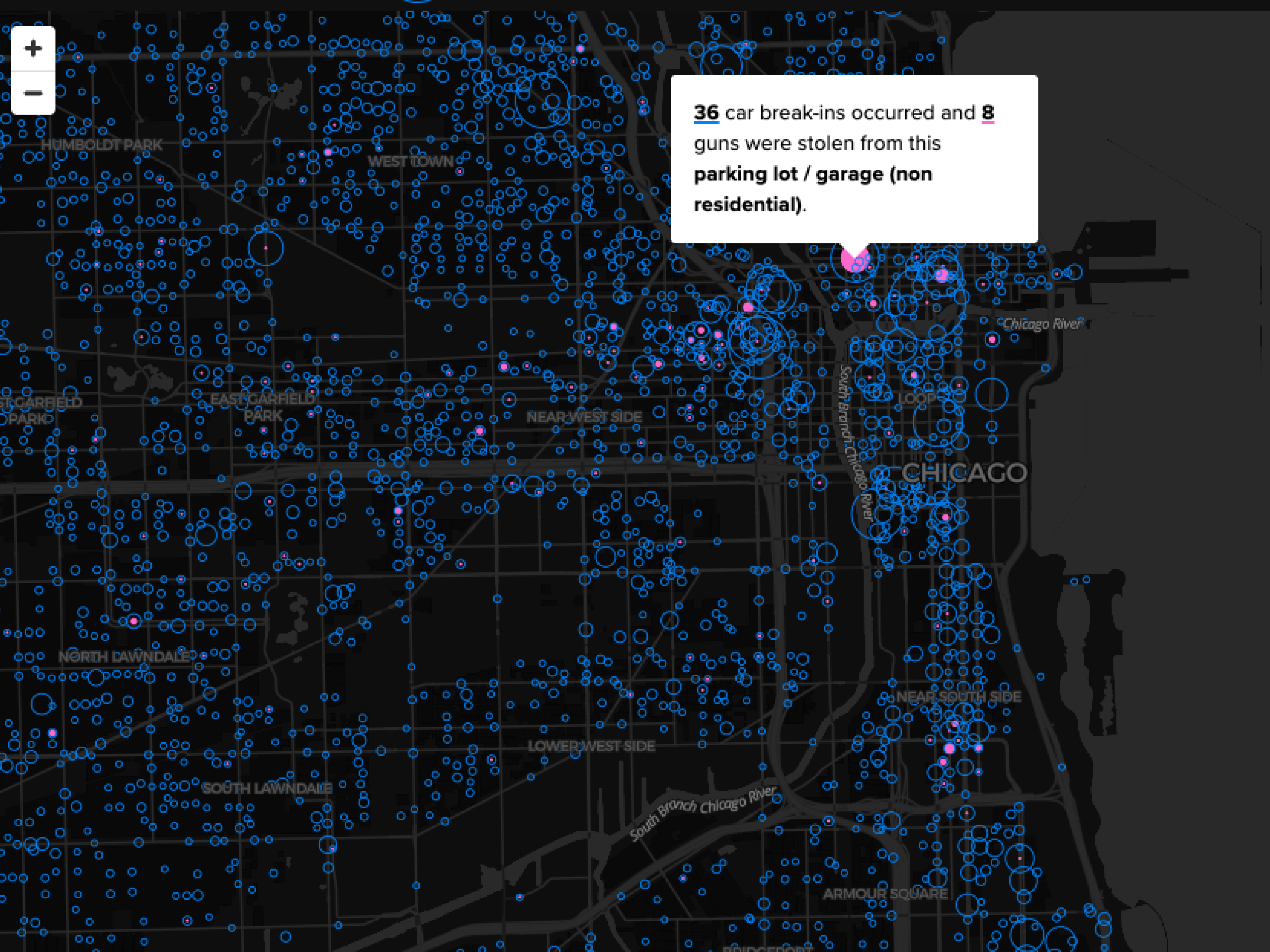
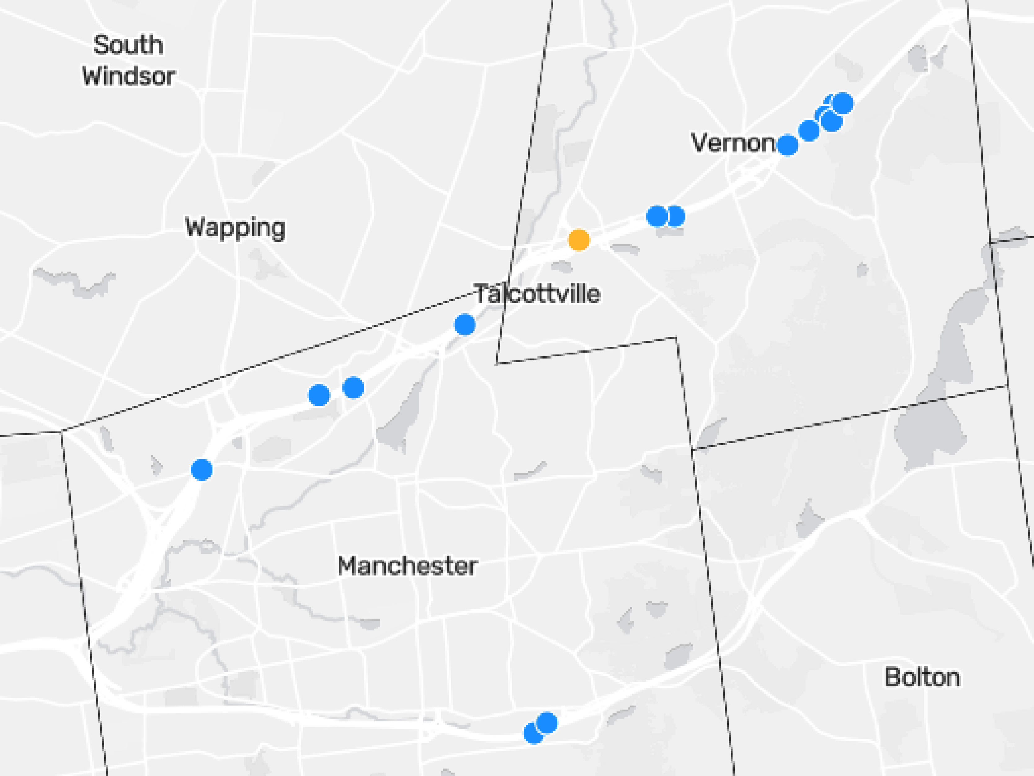
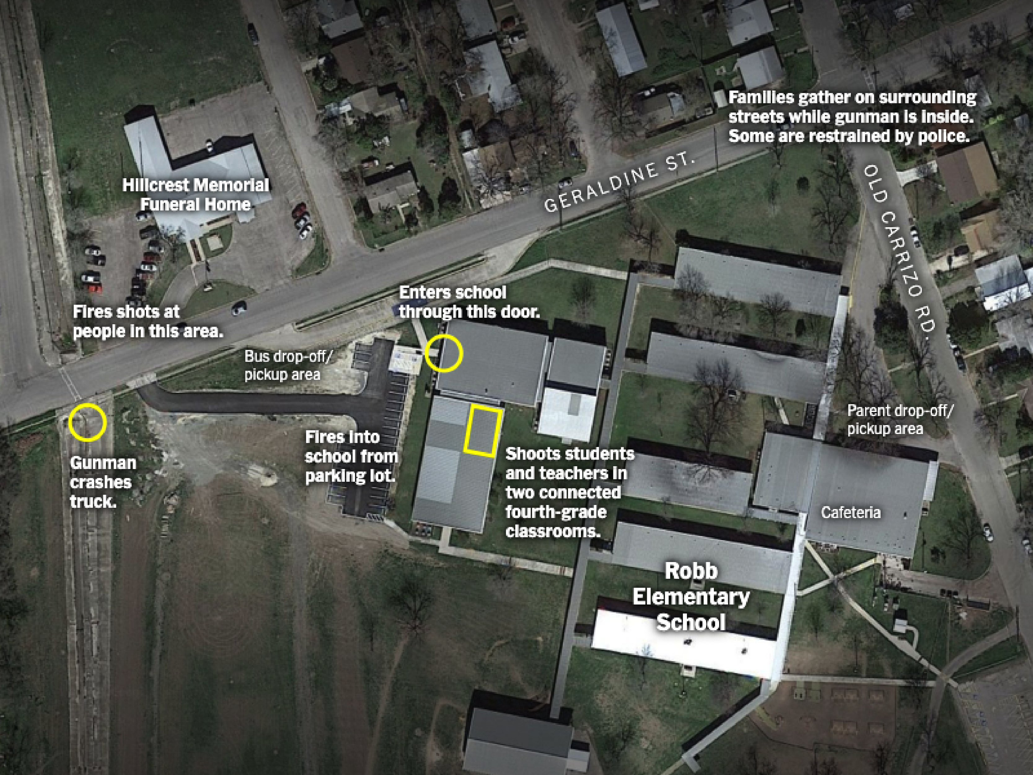
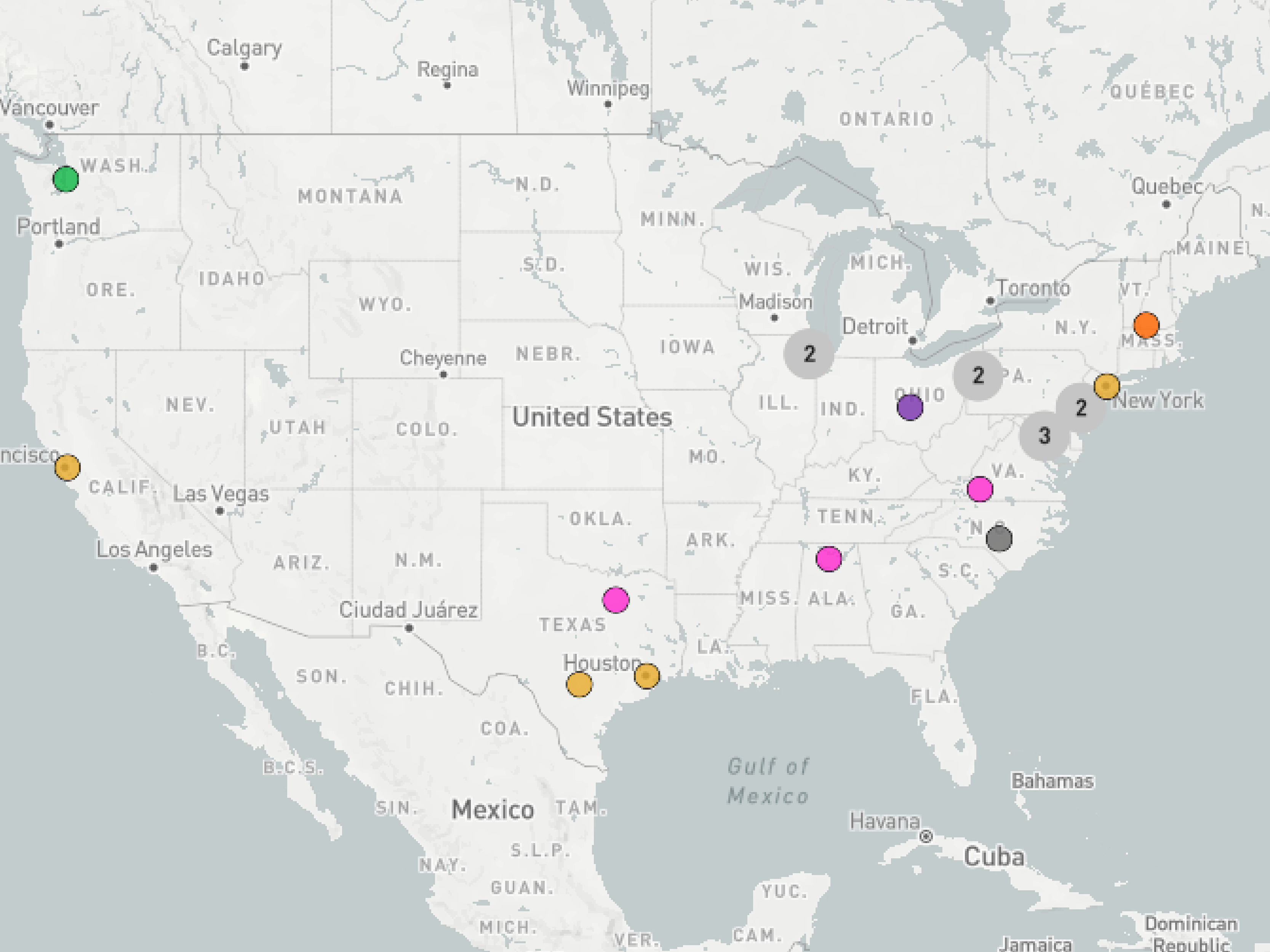
Maps and photos show how the Los Angeles ICE protests unfolded
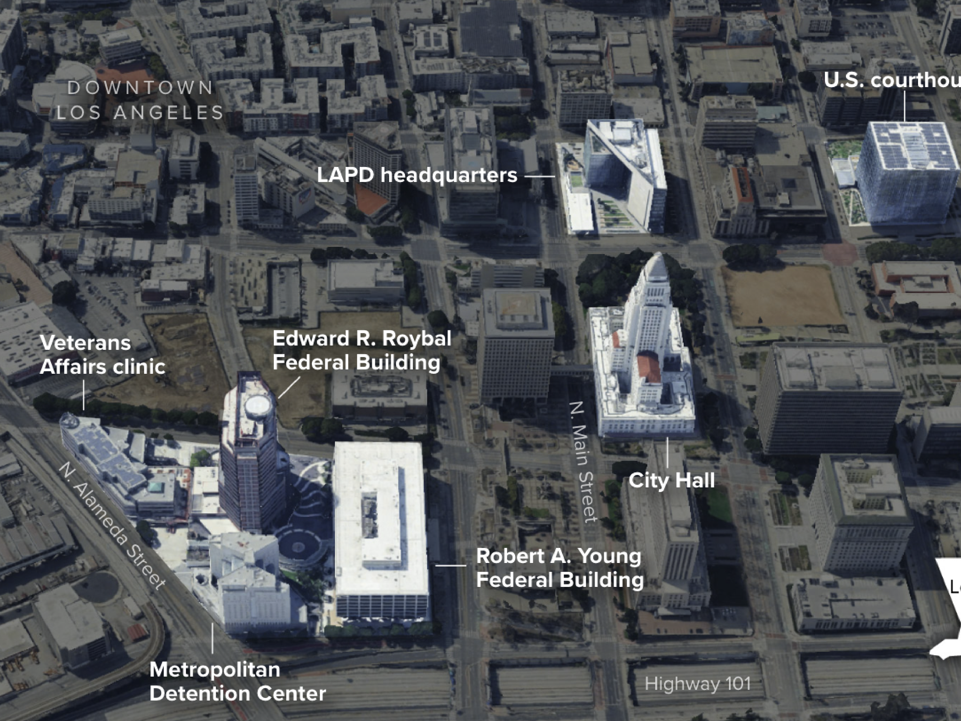
I worked with the CBS News Confirmed team to report and build a timeline of how the LA protests unraveled – using geolocation techniques and satellite imagery to map the key locations where events played out.
Note: The map in the original story may not render correctly following a CBS News site update after my departure. See it here.
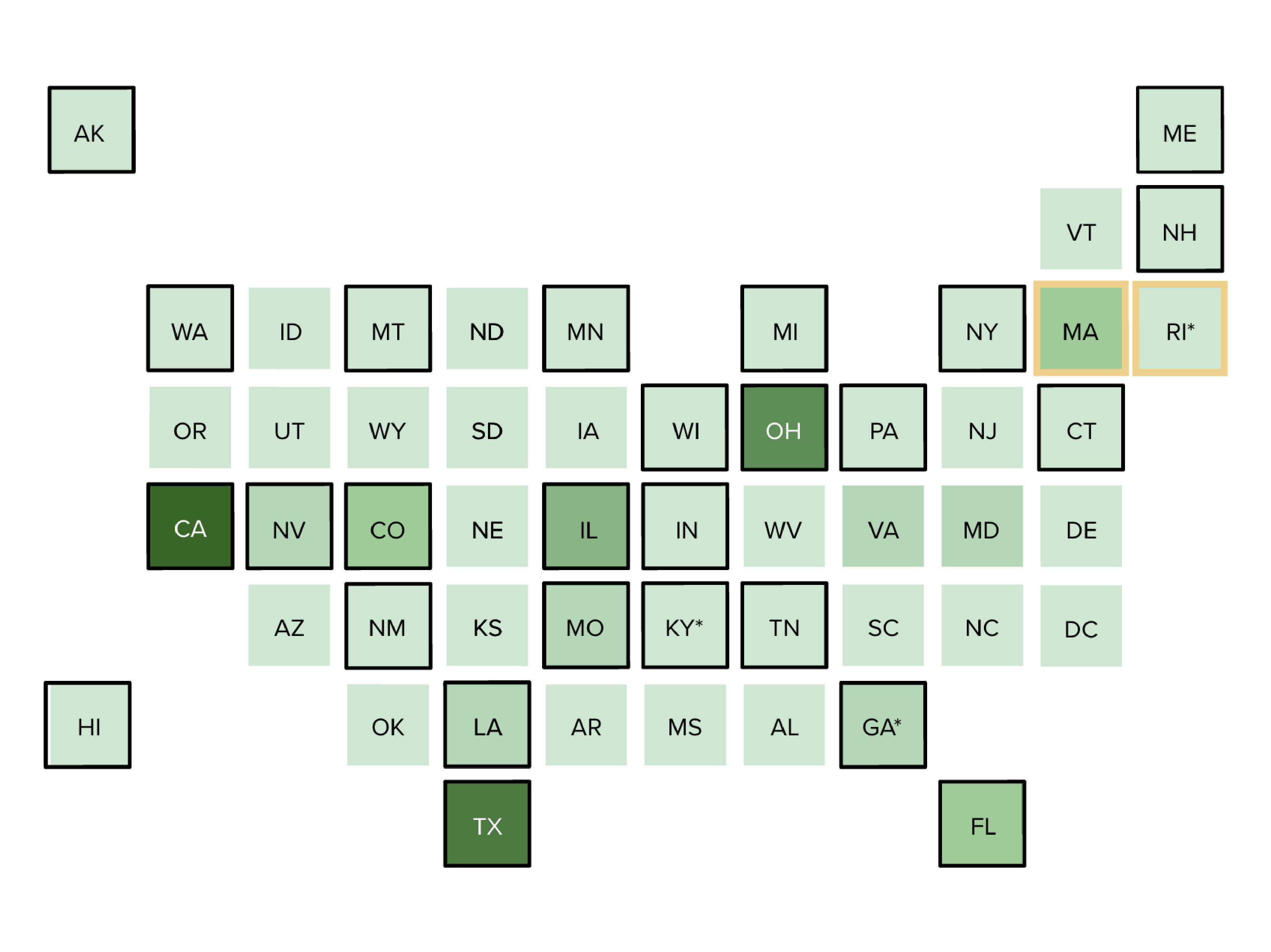
Maps show snow totals, blizzard zone for one of the Northeast's biggest winter storms in years
Note: The map in the original story may not render correctly following a CBS News site update after my departure. See it here.
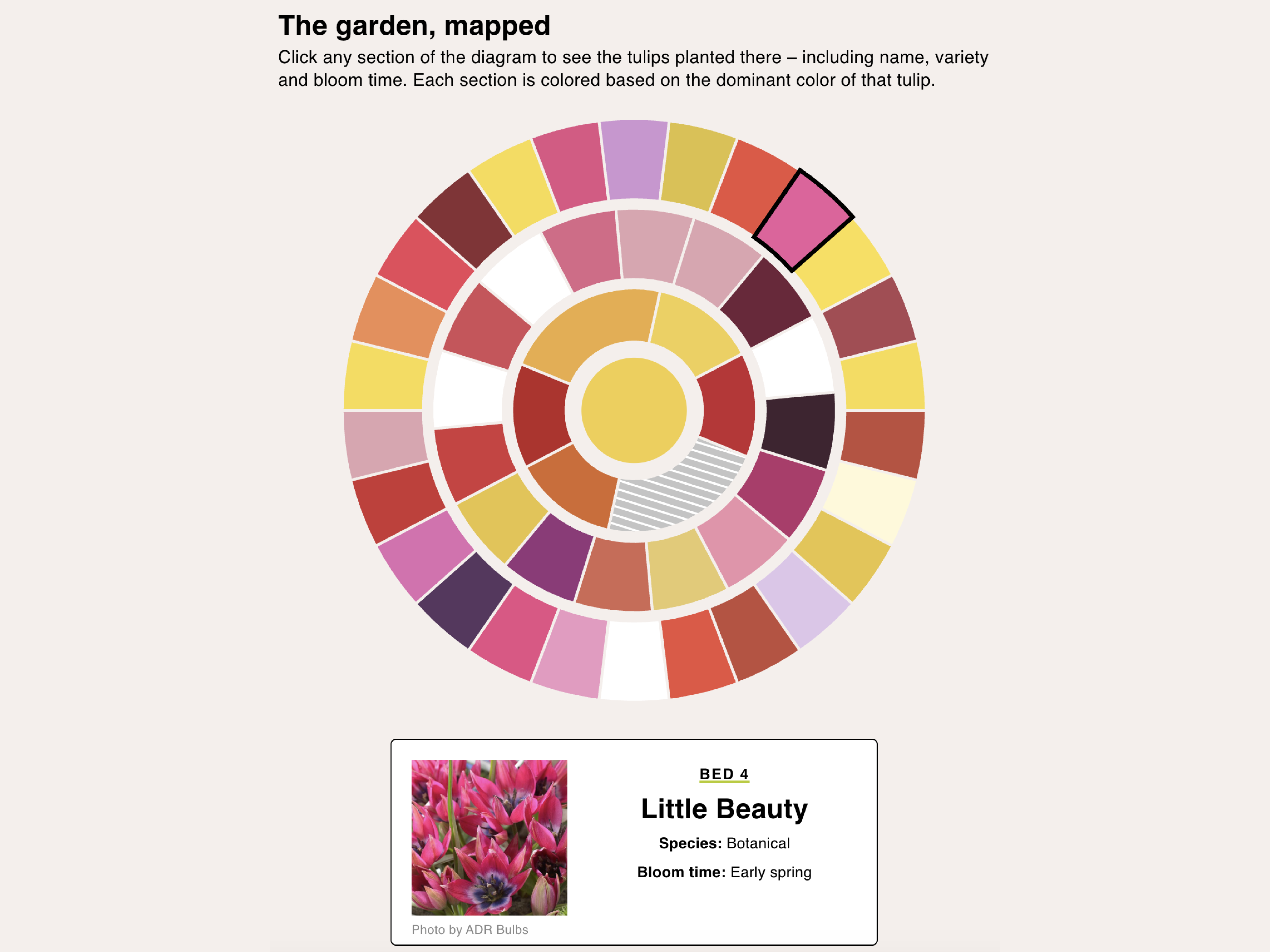
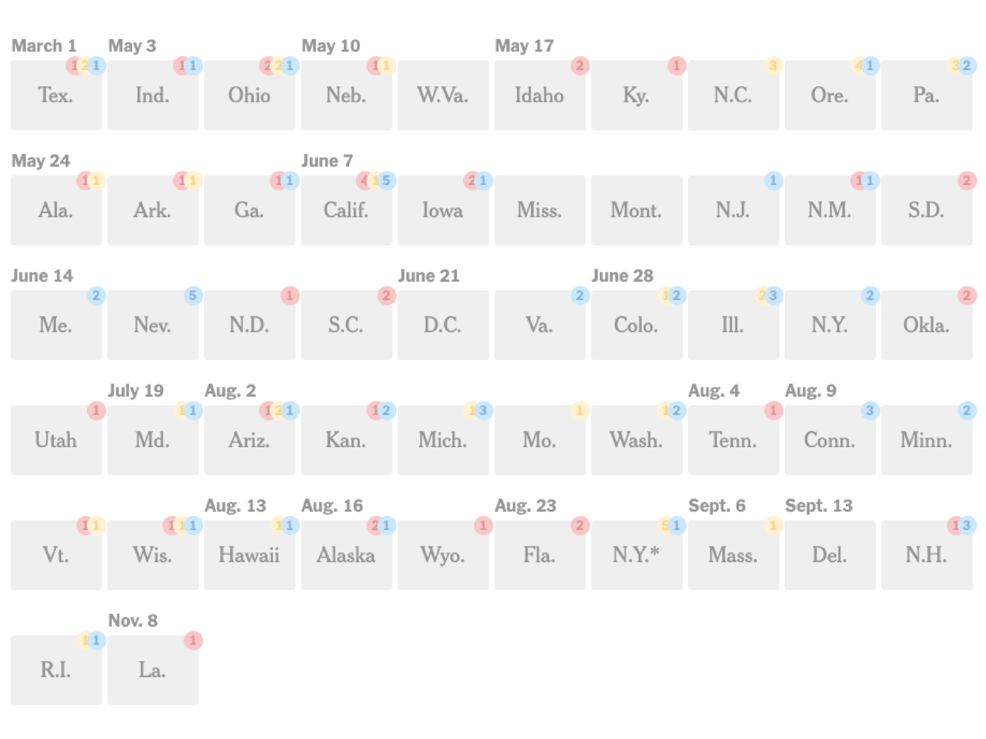
SNL's Shifting Faces
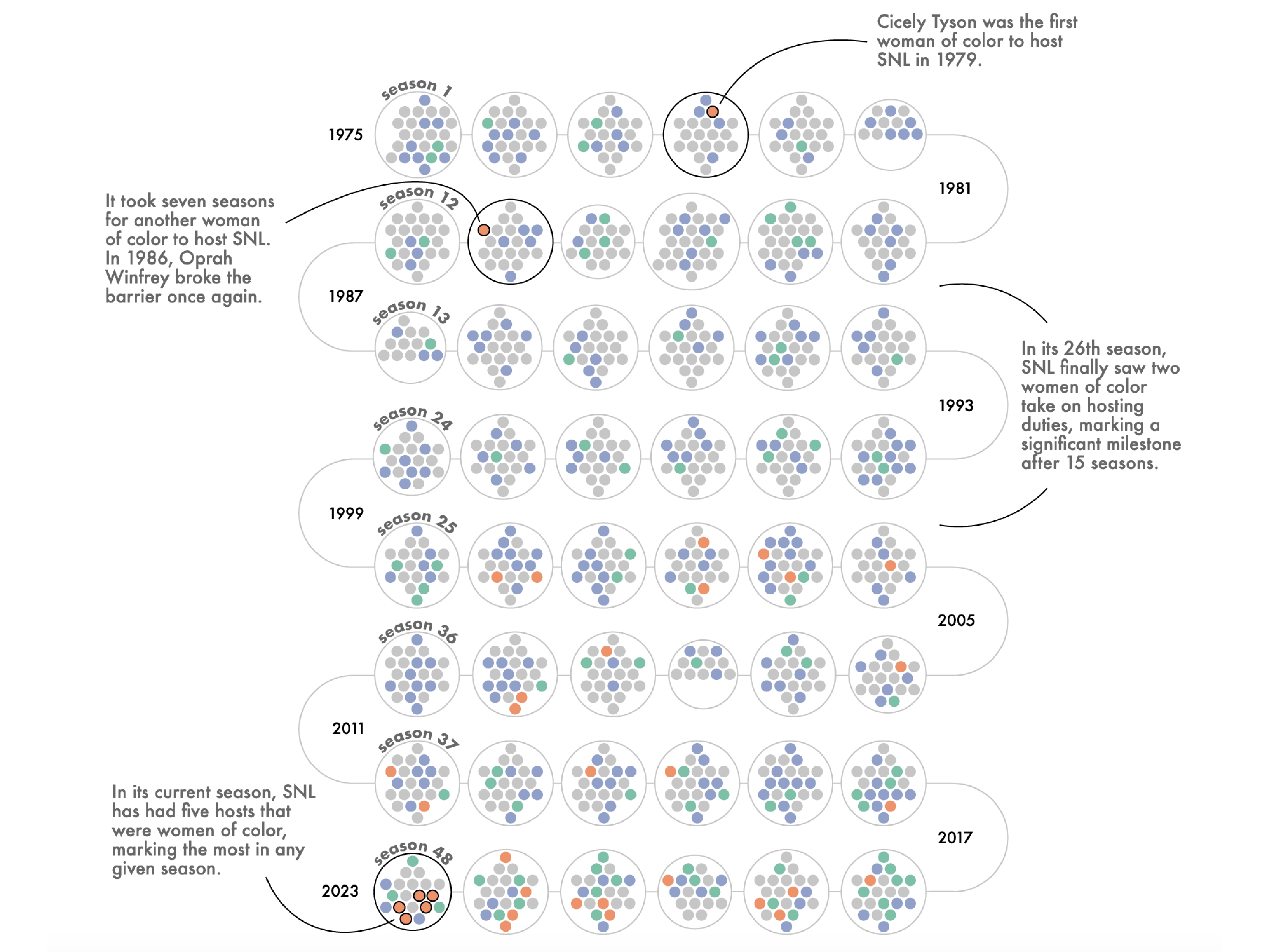
I participated in the Data Visualization Society's mentorship program. I was paired with Julia Wolfe, editor for the Reuters graphics desk. I wanted to try my hand at creating more bespoke visualizations. Read more about my process here.
🏆 Information is Beautiful Awards (Longlisted)
How I made this site
Designed in Figma, powered by Google Sheets, built in SvelteKit and hosted on Netlify.